Tuesday, November 25, 1997

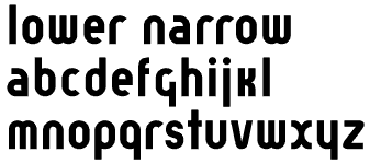
Worked on Lower Narrow

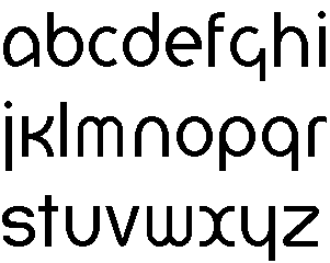
lower narrow

  • This is narrow version of Lower. It is a bit different from Lower-Regular but it still bears a family resemblance.
  • The next thing to work on is finishing up Lower-Regular (e.g., finishing up the whole character set, polishing up the spacing, etc.)

Tuesday, November 11, 1997

Worked on Lower

lower

  • Lower is based on an experimental typeface designed by Herbert Bayer in 1925. Bayer's typeface was firmly rooted in the Bauhaus, with strict geometrical construction. My interpretation is meant for more general use than Bayer's original typeface. To do this, I have started by using consistent x-height and overshoot to create a regular weight version of Bayer's font (Bayer's original font was very bold, almost a black weight). This font will be suitable for body text as well as headline use. I plan to extend the design by creating light and bold version as well
  • I have tried to keep all the distinguishing features of Bayer's original typeface, while bringing the design up to date. For example, the "r" in Bayer's version terminates in a straight line, mine is a slight curve. Tell me what you think.

Thursday, September 25, 1997

What I've been up to lately...

You might be wondering what I've been up to lately. Well, I just haven't had a lot of time to keep up this log. But I have been working on a number of projects. Some of them are:

  • Another update to Nu Sans. This time, I am basing Nu Sans on Espy Sans 10 pt instead of 12 pt. I have just finished the plain version and expect to post something soon for you to download.
  • A lowercase font.
  • I've released several different version of Virtue. The latest one is 1.9, which is available now from the web page.

Wednesday, May 21, 1997

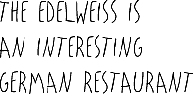
Worked on eCasual Headline


  • This is a tall casual font based on the kind of handwriting used for some of the banners on eWorld. I plan to create a regular text version as well as the tall version.

    The Edelweiss is an Interesting German Restraunt
  • As you can see, it needs some work :-) I'm going to straighten out a few characters (like the "T", "N" and "A" and tweak the spacing a bit until I get something worth releasing to the general public.

Released Jubal Sans (Formerly the Multiple Master Font)

You can see and download it on the Jubal Sans page.

Thursday, May 15, 1997

Worked on The Multiple Master Font (Working title)


  • Well, I added international characters in the regular axises. It's getting pretty close to being a complete font. As soon as the font is fully functional, I intend to release it as beta demoware.
  • Still need to come up with a name for this font. I'll post some pictures here sometime this week and you can take a look.
  • I have been doing other font stuff between this post and the last one. Check out Virtue. This is a free font that is my representation of what I think Apple's "Charcoal" font should look like. It is only available to Mac users.

Thursday, April 24, 1997

Worked on the Be Font


  • Well, I'm at it again... The system font from the BeOS is only a bitmap, so you can't use it to print out. I'm creating an outline font so that it can be used on the printer. So far, it looks like I have a lot of work ahead of me :-)

    BeOS Font
  • I need to work on these characters: A, V, W, b, d, e, p, q, s, v, w, x, y and z. Basically, these characters don't look the same weight as the rest of the font.
  • In the bitmap font, the V and Y are the same - weird, huh?

Worked on Spokane

Spokane is a bitmap font I'm working on that has the look of a light Chicago. I plan to incorporate this font into my next Kaleidoscope Color Scheme.

Spokane Font

Friday, April 11, 1997

Nu Casual

Worked on Nu Casual

  • Basically spent the whole day doing one bitmap size - 16 pt. Now all that is left is the 14 pt and then the font is ready to distribute! Hopefully, I'll have that by tomorrow. Fontographer is NOT the best tool for working with bitmaps. Unfortunately, it's the only one I have :-(
  • Can you believe it? What Apple calls 18 pt Casual is actually 20 pt and what they call 10 pt is actually 14 pt!!!! What were they thinking? I guess they needed to fool the Newt into thinking that it was dealing with a smaller font than it actually is. Weird. If someone has a better explanation for why they did this, drop me a note.

Thursday, April 10, 1997

Nu Casual

Worked on Nu Casual

  • Found a really cool method to do screen dumps on the Newton to the Mac. This has streamlined the bitmap process quite a bit. Now, instead of squinting at the screen, I can just dump the contents of the screen to my Mac and then resize it.
  • Finished a bunch of the sundry characters and stuff:

    123456789!@#$%^&*
  • Don't know what I'm going to do about the accents. They fit fine on a 18 pt bitmap on the Newton, but they aren't going to do the same on the Mac. I'm thinking I'm going to have to translate 18 pt to 22 pt or something like that. Weird. Their was a similar problem with Nu Sans Casual when I was working with the Espy Bitmaps. I guess Apple wants to have screen fonts that are much larger than they should be!

Saturday, April 05, 1997

Nu Casual

Worked on Nu Casual

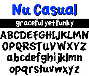
  • Another Newton based font (Nu Sans is the other, it's based on Espy Sans) from the Mart. This time, it's the "Casual" font that is used on the Newton OS to symbolize anything that the user has written in (and has hopefully been recognized correctly :-).
  • What a fun font to do! I'm very pleased with how it's coming along, although I fear that I'll go blind staring at my Message Pad 120 trying to get all those bitmaps!

    Nu Casual: graceful yet funky

Monday, March 24, 1997

Midnight

Finished Midnight (over the span of one weekend!)

  • This font is a bit more condensed that Nu Sans and has some unique characters.
  • Also finished the web page for the font.

Sunday, March 16, 1997

Finished preliminary work on Epsi Sans Multiple Master


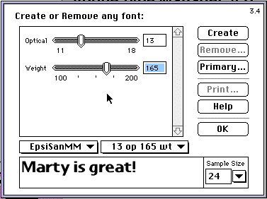
  • This is a two-axis Multiple Master font with axises on optical size and weight. It is based on the 9 and 16 pt. Espy Sans bitmap font. I currently have a working font with all the letters numbers and punctuation. Next up is those international characters and misc. doodads.

    ATM Screenshot
  • No, I haven't been away from my fonts for the past 4 months! I just haven't had time to keep the log up. I'll try to be better about this in the future.