skip to main |
skip to sidebar
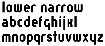
- This is narrow version of Lower. It is a bit different from Lower-Regular but it still bears a family resemblance.
- The next thing to work on is finishing up Lower-Regular (e.g., finishing up the whole character set, polishing up the spacing, etc.)
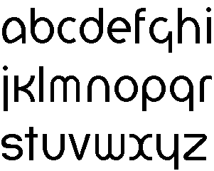
- Lower is based on an experimental typeface designed by Herbert Bayer in 1925. Bayer's typeface was firmly rooted in the Bauhaus, with strict geometrical construction. My interpretation is meant for more general use than Bayer's original typeface. To do this, I have started by using consistent x-height and overshoot to create a regular weight version of Bayer's font (Bayer's original font was very bold, almost a black weight). This font will be suitable for body text as well as headline use. I plan to extend the design by creating light and bold version as well
- I have tried to keep all the distinguishing features of Bayer's original typeface, while bringing the design up to date. For example, the "r" in Bayer's version terminates in a straight line, mine is a slight curve. Tell me what you think.