The very best output, of course, was from Xerox' Document Centre 265 DC. This machine is a next generation copier. Rather than using a photographic lens system, the 265 DC uses newer digital scanning to create superb copies. The digital process has many advantages over the older system, one of the best being the fact that you can scan in a job before you copy it.
Let's say that you have to create a report and half the pages can run through the document handler, while the other half has to be placed directly on the glass. Let's also say that you have to have 100 sets of the report. In the old way of doing things, you would run all the feedable stuff first and then run each individual hand placed page next. After all the copies were produced, you would then have to hand collate them into 100 sets. This is a sorry state of affairs!
With the 265's "build job" function, all you have to do is scan in all the pages - using the feeder where you can, and then using the glass for the other pages - select 100 copies and press start. Bingo. You've got exactly what you need, and there was no collating involved.
Of the assorted analog copiers, the Kodak 110 did the best job. Not so surprisingly, the Kodak Ektaprint 90 did the worst.
After I did all this copying, I decided to make fonts from the last generation copy from each machine. I just finished the Super Zoomer-Bold.
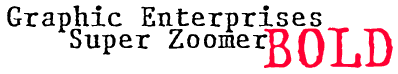
I think that this project is unique in that I am not trying to emulate the appearance of differing models of typewriters, but instead I am creating the family using different models of copiers! So this will be my obligatory distorted typewriter font family (every foundry needs one, apparently :-), but I believe that the project is worthwhile in that it takes a different approach to the typical variations of typewriter faces.
For example, I was a bit shocked to notice that the Super Zoomer stretched out the copy a bit - so the letters are actually taller than they should be, while taking up the same amount of horizontal space. The other copiers also produced interesting variations. It's hard to believe that they all started out with the same original! A copier's a copier, right? Wrong! :-)