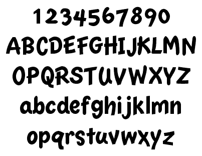
On my walk this morning, I had a design revelation: the design of each of the three sizes of Nu Casual needs to be the same. So, specifically, if the 20 pt font has a rounded end, the 14 and 16 pt fonts also need a rounded end, even if the bitmap font for those sizes does not allude to one. I don't know why I didn't design with this in mind from the beginning, as I have applied this approach on Essence. I spent a few hours today fixing the 14 and 16 pt fonts to match this new design philosophy and I am pleased with the results of the blend of the three fonts now:
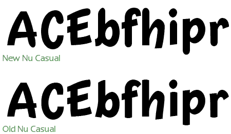
I've also made sure to include overshoot in all of the curved endings, so they will appear to be just as tall as the endings that are not curved. I don't know how relevant this is, however, since the Casual font has a very variable baseline and x-height :-)
In other news, the new season of Pretty Cure has started. This time, it is a whole new cast. They have also changed the name of the show to Pretty Cure Splash Star. Two episodes have broadcast so far, and I think that the show gets away from the "fake Dukes of Hazard" syndrome with Mai and Saki being the stand-ins for Nagisa and Honoka. The scenarios are very similar: cute little creatures from another world recruit two girls to be Pretty Cure and fight against powers that would destroy the little creatures world and probably move on to Earth, too, for good measure.
However, there are already some differences in the setups of the two shows, for one Mai and Saki seem to be willing to take up the mantle of Pretty Cure right away, whereas Nagisa didn't want to (partly because she thought she could never get along with Honoka). Also, it turns out that Mai and Saki met each other (and the magical creatures) before becoming Pretty Cure years ago. So they have a bit of destiny playing out for them in the new show.
The production values for the new show are excellent. There is a greater use of CG (unobtrusively) and the character designs are appealing (Cure Bloom's pineapple hairdo notwithstanding). Basically it looks like they know what worked well in the first show and have expanded on it, rather than reinventing everything. Like Nagisa, Mai is into sports and like Honoka, Saki is the brainy one. It worked as a good contrast before, so there's no reason to change it.