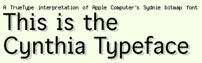
Well I did it in just one day - I created the basic character outlines for the Cynthia typeface in under 10 hours. Tomorrow I'm moving on to the hinting so that I can release a demo version ASAP. Basically, Cynthia is a TrueType font that emulates the appearance of Apple's Sydnie bitmap font at all different sizes. So what, you as is Sydnie? It's a font that's embedded in Apple's QuickTime Player 4.0. It's the cool little font that appears when you press the copyright button, or connect to a streaming server. Basically, it's what I'd call quasi-monospaced. Most of the characters fit into a 6 pixel width, but some of them (like "i" and "l" as well as most of the punctuation) is proportional - making it only appear to be monospaced. I have no idea why Apple would want to do this, but hey, it's their show, right? Anyway, here's a screenshot:
No comments:
Post a Comment