Well the first month of the new year is almost over. I feel that I've accomplished a lot, but there's still a lot more to do. I finally finished up the number in Nu Casual 3. However, the blended design needs some further tweeking, so I'll post a sample later.
Lately, I've been listening to Horie Mitsuko and the Pretty Cure image albums. An odd combination! Horie is one of those singers that you can immediately identify. She's been around forever (she's been singing professionally longer than I've been alive) and has done a good job maintaining her voice. I was unsurprised to read that she also plays violin. Her expert use of vibrato on long notes belies her other skills :-)
Most of her songs from the 70s are in an American 50s style which I like quite a lot (current favorite: Candy Candy). Times were simpler then, or at least the music was. Her latest work can be heard on the ending music duet in the first season of Godannar. Great show, BTW.
Sunday, January 29, 2006
Monday, January 23, 2006
Nu Casual 3
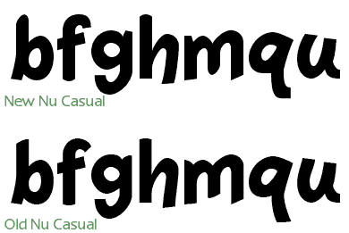
I've done more work on Nu Casual 3. Today I focused on the lower case characters. Mostly I'm finding that the type of design choices are making tend to be making Nu Casual a bit more normal. The original Nu Casual had a few design oddities that were purely a result of the process, rather than aesthetic choices. So I'm taking a less mechanical approach this time.

Sunday, January 22, 2006
Well, well, well...
Have you ever tried to do something new and found that it was harder than you thought? And along the way, has someone shaken your confidence--making it even harder to accomplish your goals? Well that's happened to me. But I'm not giving up, no way. I'm going to keep trying until I get it right (Kaleidostar reference, by the way).
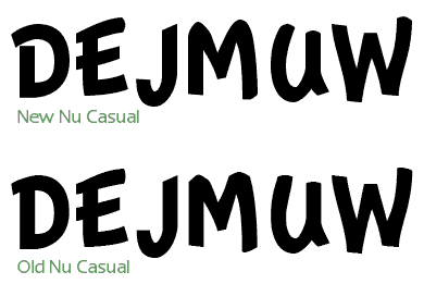
So anyway, I've been working on Nu Casual lately. I started on a 3.0 version back in 2000, but I got distracted and never finished. The funny thing is that Nu Casual was a design prototype for Essence. I took the three bitmap sizes of Apple's Casual font from the Newton OS and made an outline font for each one. I then merged them together to make one outline font that had all the characteristics of the three bitmap designs.
I was very happy with the results from the original Nu Casual, however, I've always thought it could be a bit better. So that's what I'm doing. But instead of just working on the one font that is Nu Casual, I'm going back to the original three outline designs. I figure that I can come up with better ways of approximating the original bitmap design by working directly on that.
I use the template layer to store the original bitmap of the size I'm working on. So I need to be able to see the original bitmap and the vector shape at the same time. The problem that I've been having (at least up until today), is that FontLab altered Fontographer's template layer display. Fontographer displayed the template image as pure black, instead of the grey that the older version of Fontographer. This makes working on the vector shape difficult because you can't see what you are doing.
Thankfully, version 4.7.2 fixed this problem!

Wednesday, January 18, 2006
Moving the blog to Blogger
In the near future, the Scooter Graphics Font Blog will be on Blogger. I've already transferred all the entries (from 1996 to today) to http://scootergraphics.blogspot.com/. The only thing left to do is to develop a template so that my blog has the same look as the rest of the Scooter Graphics web site. I don't imagine that will be too hard.
I got the UNDER17 final concert DVD yesterday. Super sweet! Halko has super powers over audiences. It was amazing to see all those glow sticks waving and people jumping in sync to the music. Not just a group of people near the front--the whole place was connected up.
I've been listening to Halko's newer material (post-UNDER17, that is) and I can definitely hear a difference. The UNDER17 material was really good, but it was more limited than the songs that Halko is doing as a solo performer/composer. She's broadening her scope these days to many different styles. She's already mastered the dempa music style, so it's on to the next challenge for her.
Saturday, January 14, 2006
Home page up-scaling
You will notice that the home page is a bit larger. I've increased the size of everything by 33%. It was pretty easy to do, once I had the CSS code all set. Just multiply all the pixel dimensions by 1.33333 and you're set :-) I also increased the size of the images. The eWorld style icons were enlarged using two different methods. For some of the icons, I have designed scalable vector versions in Photoshop. So resizing those is trivial. For the rest, I found a method that seems to give good results without looking too fuzzy (a problem when resizing images from small to large).
First, I quadrupled the size of the original image with nearest neighbor resampling. Then, I copied the color table to the desktop. After that, I convert from index color to RGB. Next, I resize the image down to the size I want using bilinear resampling. I finish by converting from RGB to index color, using the color table I have on the desktop to make sure the colors stay the same.
Pretty easy, but it took a bit of experimenting with different resampling methods to get satisfactory results.
Friday, January 13, 2006
Early morning adventure & Essence update
So I got up this morning at 2 am to get cat food. However, I had to go to three stores to find one that was open 24 hours a day. Here's a surprise to me: the real world is NOT like the Internet. On the Internet, everything is open 24 hours a day. The real world, not so much.
Pixel is happy, though, and that's what matters.
Essence is coming along nicely. I'm considering selling a "deluxe" version with all the different point size fonts included. Basically a recap: I'm designing another Espy Sans font called Essence. This time, I'm creating a scalable font based on four different point sizes of the original Espy Sans font.
So to do that, I: 1) create a scalable font for each of the 10, 12, 14 and 16 point sizes Espy Sans, 2) use Fontographer's Blend function to create a 11 point font based on the 10 and 12 point fonts, 3) Blend the 14 and 16 point fonts to make a 15 point font, 4) Blend the resulting blended fonts (11 and 15 point) to make a 13 point font. Simple!
Each different point size of Espy Sans is a little different in design. So each of my fonts based on those sizes is also different. It seems like a shame to design four fonts and then just release one.
In related Essence news, I've decided not to alter the letter spacing from my blended design. I tried that, and what I got was a font that looks OK, but doesn't really look that much like Espy Sans on screen. So the extremely tight letter spacing of Espy Sans will be carried through into the design of Essence.
Tuesday, January 10, 2006
2nd Level Solution
After investigating a way of doing the secondary navigation with a seperate unordered list, I've decided to do something even simpler: just a single line of HTML with pipes between the links. This was the look I wanted for the secondary navigation, anyway! (I tend to prefer simplier design. Intricate work is beautiful, but it's not my specialty, so I design what I do best.)
The secondary navigation goes into the banner area, so I either have to put the banner as a background image or use a seperate DIV for a shortened banner. I'm thinking I'm going with the seperate DIV for the banner graphic under the navigation. My primary reason: in CSS-less browsers, putting the banner image in the background will result in no banner at all being displayed. I'm sure, dear reader, you would agree that outcome is non-optimal!
The secondary navigation goes into the banner area, so I either have to put the banner as a background image or use a seperate DIV for a shortened banner. I'm thinking I'm going with the seperate DIV for the banner graphic under the navigation. My primary reason: in CSS-less browsers, putting the banner image in the background will result in no banner at all being displayed. I'm sure, dear reader, you would agree that outcome is non-optimal!
Monday, January 09, 2006
2nd Level Navigation
I think that FLOAT is best avoided if possible. What worked fine in Safari and IE on the Mac did NOT work fine on IE on Windows. I was previously floating the SG corner logo and the putting the banner next to it. Totally unnecessary, now that I think about it. When you have two elements that have known pixel dimensions, using absolute positioning makes much more sense. I keep running into this at work, too: if you have two possible solutions, pick the simplest one. A lot of times, I think I understand something, but I really don't. But that's OK! Part of learning is getting over the fact that you don't know everything you need to know :-)
So I've been searching and searching for tutorials on doing second level navigation with CSS tabs. Most of the solutions I have seen require the first level of tabs to be all the same width and in some implementations, changing the font size in the browser badly breaks the tabs. Not good... Too many compromises are being made to do something that should be simple. That should be your first clue that you are barking up the wrong tree.
I think the problem is that folks are trying to used nested unordered lists to acheive the two levels. This is a mistake, in my opinion. It would make sense to do that if access to second level navigation was necessary on every page. But that's hardly ever the case. Second level navigations is only of any good to users if it is attached to the first level navigation that it goes with! Using nested unordered lists in this manner produces a site map on every page in browsers that don't support CSS.
Loading the user up with information that they don't currently need is no favor to them!
So my two-level navigation solution is simple: instead of using nested unordered lists, I'll use two sets of unordered lists. The main tabs will be on the first set and the second level navigation will be on the second set. This means that the main tabs can stay the same for each page, while the second level navigation will have to be re-written for each main level. That's not so bad, really. And it keeps a lot of unnecessary code out of individual pages.
I can't believe I've wasted a whole day looking for a no-good solution when there was a simple, correct, one waiting for me at 9 pm!
P.S. I still don't know how/when to use FLOATs :-)
Essence
So have begun finishing the work on my Essence typeface. I am very happy with the appearance of Essence on anti-aliased displays. It's very Espy Sans-ish. I've been using Essence for about 3 years now, but I've decided to finally release it this year. Yeah! Finally a new font :-)
Saturday, January 07, 2006
CSS conversion
The home page is now formatted entierly with CSS. I got the "Reaching Out" to float in the correct position this morning. It is just a nested list! Simple solutions are the best.
I'm starting to think that an enlargement of 150% from the original design might be a little too big. I was basing my change on the improvement in screen resolution since the site was launched. The difference between 72 ppi and 96 ppi is 1-1/3x, so that would mean just 133.3%. Fortunately, pencils have erasers and graphics can be resized down.
I'm looking forward to adding tabs to all the pages. Maybe I'll work on that tonight after I get back from riding my Vespa. Ciao!
Friday, January 06, 2006
Old eWorld recreations
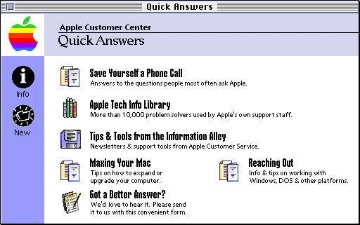
I've been having fun trying to recreate old screens from eWorld in CSS and HTML. Since most computers don't have the old eWorld fonts on them, the recreations don't look exactly the same, but they are pretty close.
The original eWorld screenshot:
My HTLM/CSS version :-)
I'm having trouble getting the "Reaching Out" to float, so I left that off on my first attempt. Perhaps a different apporach will get the same effect. I'm thining that maybe if I make that a second level unordered list, it might work.
The original eWorld screenshot:

My HTLM/CSS version :-)
I'm having trouble getting the "Reaching Out" to float, so I left that off on my first attempt. Perhaps a different apporach will get the same effect. I'm thining that maybe if I make that a second level unordered list, it might work.
Tuesday, January 03, 2006
Halko
I think I've found something that will solve my font problem. It's an automated system of replacing text with a graphic called PHP + CSS Dynamic Text Replacement. Yeah!
In other news, I went to the Post Office this morning to pick up my package from Japan. I ordered two Halko (Haruko Momoi) items. One was a CD+DVD of Majokko Tsukune-Chan. It's a 15 minute show (just one short episode on the DVD) about a magical girl who seems to be a bit of a troublemaker. I've watched it and wish I could tell you more about it, but my Japanese is very limited :-(. Another problem is that there is almost zero information about the series in English. (Just watch, this blog entry will become #1 in Google.) In the very first part of the episode, she "rescues" a stranded, starving hiker by magically barbecuing her mascot character for him. He appears as a ghost in the remainder of the episode.
So Halko provides the voice for the main character as well as singing and composing the opening and ending songs (the full versions are on the accompanying CD). The songs are very different from her previous work, at least in terms of instrumentation. I may be wrong, but I don't think I heard a synthesizer of drum machine on either one! The opening song starts with violin (played "fiddle" style), xylophone, banjo and drums. A flute, glockenspiel and spoons can be heard later in the song. Halko sings in her "cute" voice, of course.
The other Halko item was Wonder Momo-i. This has two songs that NAMCO uses in the game "Taiko no tatsujin." Folks that are familiar with Halko's sound are bound to be surprised by the title song.
Wonder Momo-i starts out electronic and then quickly moves into horns, guitar, Hammond organ and drums played in a Mighty Mighty Bosstones style. Halko sings in her "cute voice" mode. Suddenly, a hard rock guitar starts up and the vocals take a more aggressive tone--the first time I heard it, I was sure there was another vocalist on the track. Someone really good, too. Nope, still Halko! She has an amazingly flexible voice. (A similar surprise is waiting for fans of Monica Rial when they hear her performance as Jo in Burst Angel.)
She also sings her own baking vocals on this track. I've noticed this before, she has developed a "method" to these. She uses a different voice for each baking part. So if the main vocal is say: cute and a little sexy, the baking vocal will be VERY cute and innocent. Quirky, but very, very good!
L-O-V-E! Do your best! Momoi!
Monday, January 02, 2006
Table-less layout using CSS
Happy New Year!
I'm getting a lot closer to having a table-less layout using CSS. I'm finding that of all the technical tricks I'm learning, the most important trick is to stay organized. I've actually sketched out the different parts of the site on a piece of paper and refer to this as I'm working with nested DIVs. It's really helpful.

What isn't helpful is font embedding. I'm trying to acheive a certain "look" based on the eWorld user interface. So I need to use a bold narrow font for some of the text. Unfortunately, Impact is a bit too bold and not narrow enough. Arial Narrow is OK, but doesn't really duplicate the look. If I could just embed the font I want to use, I wouldn't have to go through this compromise! But current embedding technologies for web browsers are pretty bad and not well supported.
So maybe I'll use images for the text I want. I know that sounds very non-CSS-y, but as a designer, it's what is necessary. Hopefully the future will provide a better solution. In the meantime, I'll just make sure that the alt tags of the images are correct. THAT is a compromise I can live with :-)
I'm getting a lot closer to having a table-less layout using CSS. I'm finding that of all the technical tricks I'm learning, the most important trick is to stay organized. I've actually sketched out the different parts of the site on a piece of paper and refer to this as I'm working with nested DIVs. It's really helpful.

What isn't helpful is font embedding. I'm trying to acheive a certain "look" based on the eWorld user interface. So I need to use a bold narrow font for some of the text. Unfortunately, Impact is a bit too bold and not narrow enough. Arial Narrow is OK, but doesn't really duplicate the look. If I could just embed the font I want to use, I wouldn't have to go through this compromise! But current embedding technologies for web browsers are pretty bad and not well supported.
So maybe I'll use images for the text I want. I know that sounds very non-CSS-y, but as a designer, it's what is necessary. Hopefully the future will provide a better solution. In the meantime, I'll just make sure that the alt tags of the images are correct. THAT is a compromise I can live with :-)
Subscribe to:
Comments (Atom)