Saturday, December 30, 2000

First attempt at Essence

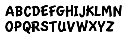
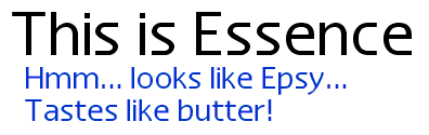
Into the wee hours of the morning, I finished off the alphabet characters (and a few punctuation marks) for my newest font: Essence. I've got a pretty good description of what I'm trying to accomplish in the last log entry, so I won't repeat myself. But I thought that a screen shoot might be a good thing to show at this first "milestone" for Essence...


If it looks like Epsy (or Espy, whatever, it's early in the morning, you can't expect me to spel!), that's intentional. I printed out a bunch of text to compare Essence to my Nu Sans. Essence wins hands down as being the most "Espy"ish. It looks good on paper, but my main goal is to have Essence be a great screen font first--it should look good under any circumstances: aliased, anti-aliased, grid fitted, whatever. I'll explain later...

Monday, December 04, 2000

The essence of a good font

Just watched the first part of the new "Dune" on Sci-Fi. It looks pretty good, but I'd like to see the David Lynch version after so that I can compare. I saw it as a kid and didn't understand it too well. Perhaps now that I am older and wiser it will make more sense :-)

Along the same lines as the new Nu Casual, I am creating a new font. This new font is based on Espy Sans, but it goes a different direction than my Nu Sans. Where Nu Sans is a printer-friendly Espy Sans, the new font will try to more closely match the design of the original bitmaps. I have found that basing a font on simply one bitmap size as a model is not optimal.

The process will take quite a bit more time, as each finished font is the average of four fonts. I design an outline to fit the 10, 12, 14 and 16 bitmap fonts of Espy Sans. I know that I have a good outline by performing a simple check: I generate a bitmap font double the size of the font I'm working on. If that looks good, I'm set. After the outlines for the four fonts are good, I combine them into one font (actually a three step process: 10 + 12, 14 + 16 and then combining the results of those two).

I was toying with a name for this new font. When I had to change the name of Epsy Sans, I polled my users and they all voted on Nu Sans. This got Apple off my back. It was a week later when I got an e-mail from one of my users congratulating me on the new name, saying that I was able to thumb my nose at Apple after all. You see, "Nu Sans" is pronounced the same as the English word "nuisance." Indeed, I was a nuisance to Apple :-)

So I thought about basing the name of the font on this chance semblance of syllables. I wanted to keep something of Espy Sans (what inspired the new font) while still respecting the legacy of my work on Nu Sans. So I started thinking about "E" as in Espy. E Sans? No, that won't do--too obvious. Apple would burst a blood vessel. But there is a word that sounds something like it: "Essence." I like the implications of the name. It is the literally the essence of Espy Sans. I am taking the individual characteristics of each bitmap size and merging them into one font. It really works for me.

I should have some pictures up soon.

Sunday, August 13, 2000

Over the handlebars

I went over the handlebars of my bicycle on Tuesday, so I've not been able to do much work on the computer lately. However, I'm starting to feel better. I was able to work sporadically on an update to Nu Casual. I'm creating outlines for each of the three bitmap sizes of the Newton handwriting font and then merging them together. Previously, I just based Nu Casual on the 20 pt. So far, I'm very pleased with the results. Here's the new uppercase:

Wednesday, July 12, 2000

John Steed

OK, here's John Steed:

Little Kitty

And, back to sleep, again...

Sleepy Kitty

Tuesday, July 11, 2000

Welcome to the family

I'm working on an update to Nu Serif that brings two new fonts into the family: SemiBold and SemiBold Italic. I've also discovered a few discrepancies in the design of Nu Serif (even after the 4.0 "harmonization" release a few weeks ago). Just a few minor things, like the regular version of a letter would have one or two more control points than the bold version. There were also a few major things that I changed. I removed the serifs from the italic "r"s and created a new "y" for the bold italic, so that it would look more like the italic "y". The "y" I had before was completely different!

This release will also be the start of a new policy at Scooter Graphics: when a font is released, the font pack will also be released on the same day. This might put back the release by a few days, but I think that in the long run it will be much less confusing for everyone. I'm not going to worry about waiting for info-mac to get my new release, but I will start uploading to them so that users in other countries can have an easier time downloading my software.

Wednesday, June 28, 2000

Everything's up to date in Scooter Graphics City

I'm making a bunch of changes to the web site. My goal is to bring everything up to date with my new font designing software (FontLab) and to update the documentation on some of my older fonts so that it is more professional. I'm also working on a quickie update to Nu Serif that will add Nu Serif-Semi bold and Semi bold Italic to the family. All of this should be final by the first week of next month.

I'm also going to experiment with updating the fonts simultaneously with the font packs. Hopefully, this will mean that more people will opt for the font pack (which is a better deal for them and me). I'm going to go back to using Info-Mac as my backup FTP sites for my individual font packages, so this should offset any bandwidth issues.

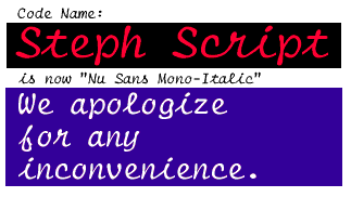
I'm very grateful for all the nice things people have been saying about my new Nu Sans Mono-Italic (shown below). It's good to know that my work is appreciated :-)

Code Name: Steph Script is now Nu Sans Mono-Italic

Tuesday, May 09, 2000

Font repair time

Okay, so it wound up being Tuesday... Oh well. I found a small glitch in the Windows version and decided to put off the release a day so I could fix the problem. Flint was having trouble with the TrueType instructions in the Nu Sans Mono-Italic font. So I opened up FontLab and made the necessary repairs. No big deal. Anyway, I am working on some rather minor changes to the font family to be incorporated with the release this Tuesday of the Nu Font Pack as well as Nu Sans Mono 2.1. I'll have a demonstration here of the changes tomorrow.

Friday, May 05, 2000

Tuesday, April 11, 2000

Nu Sans 9.4

Released Nu Sans 9.4.

Tuesday, August 24, 1999

Scooter Graphics on hold

It's been a while since I've updated the log. I've been busy adjusting to my new job (actually, the same company I was working for, before, but it a different capacity), so I've put Scooter Graphics on hold for a while. At my job I work with several different copiers. As an experiment to find out which ones produced the best copies, I typed up a few lines of type on a typewriter and proceeded to enlarge them by 110% 14 times. The results were interesting, to say the least. Most surprising was to learn that 110% on one machine does not equal 110% percent on another!

The very best output, of course, was from Xerox' Document Centre 265 DC. This machine is a next generation copier. Rather than using a photographic lens system, the 265 DC uses newer digital scanning to create superb copies. The digital process has many advantages over the older system, one of the best being the fact that you can scan in a job before you copy it.

Let's say that you have to create a report and half the pages can run through the document handler, while the other half has to be placed directly on the glass. Let's also say that you have to have 100 sets of the report. In the old way of doing things, you would run all the feedable stuff first and then run each individual hand placed page next. After all the copies were produced, you would then have to hand collate them into 100 sets. This is a sorry state of affairs!

With the 265's "build job" function, all you have to do is scan in all the pages - using the feeder where you can, and then using the glass for the other pages - select 100 copies and press start. Bingo. You've got exactly what you need, and there was no collating involved.

Of the assorted analog copiers, the Kodak 110 did the best job. Not so surprisingly, the Kodak Ektaprint 90 did the worst.

After I did all this copying, I decided to make fonts from the last generation copy from each machine. I just finished the Super Zoomer-Bold.

Super Zoomer

I think that this project is unique in that I am not trying to emulate the appearance of differing models of typewriters, but instead I am creating the family using different models of copiers! So this will be my obligatory distorted typewriter font family (every foundry needs one, apparently :-), but I believe that the project is worthwhile in that it takes a different approach to the typical variations of typewriter faces.

For example, I was a bit shocked to notice that the Super Zoomer stretched out the copy a bit - so the letters are actually taller than they should be, while taking up the same amount of horizontal space. The other copiers also produced interesting variations. It's hard to believe that they all started out with the same original! A copier's a copier, right? Wrong! :-)
Saturday, July 03, 1999

Nu Serif is nearly complete

I finished off the numbers and punctuation. Now I just have some miscellaneous characters and accented characters to take care of.

Wednesday, June 23, 1999

Nu Serif lowercase

I finished hinting the Nu Serif lowercase!

Saturday, June 19, 1999

Nu Serif hinting update

I finished hinting the uppercase and completed hinting a, b, c. Still a lot of work to go!

Friday, June 18, 1999

Nu Serif

Worked on Nu Serif off and on today. I've finished hinting A-P, T-V, i, n and o. I'm off to a good start! I hope to finish the uppercase tomorrow and make a dent on the lowercase. It's slow going, but the results are worth it. Here's a peek at the "B"
Line of Bs

Pretty neat, huh?

Thursday, June 17, 1999

Nu Serif TrueType hinting adventures

I'm now working on Nu Serif in Microsoft's Visual TrueType program. This is the hinting stage, where I hand edit the hinting instructions of the font to achieve great on-screen readability. I had some initial problems with FontLab (good thing I use Font Validator on FontLab's output). I'm still getting "multiple component glyph scaling flags set" error messages (which will really crash your system hard if they are installed) in every other generation of fonts from FontLab. I have no explanation for this - without changing any settings, I got good results the next time. Weird. Hopefully they'll nail down the problem in the next release.

I've already hinted the uppercase control characters (H, I, O, V) and I was surprised by how easy the process was. In fact, the serifs don't create much of a problem. The trick is to always do them the same way. That way you can build up speed while achieving consistent results in the font. I'm also finally getting the hang of the "stroke" function (this is the one that works with characters that have diagonal elements, like "V" or "W". At first, this function was giving me a stroke! But I've got a pretty easy rule of thumb: first and third points must have horizontal and vertical control, second and fourth must have either horizontal or vertical control, but not both. The reason for this approach is that in order for the stroke function to do its job, it needs freedom to move in either direction on half the points. If that all sounds complicated, believe me, it isn't once you've got the hang of the program :-)

Tomorrow, I help my friend Daisy move furniture. She formerly had her boyfriend (who she hasn't talked to in 3 months - she doesn't think that they are going out anymore :-) help her move stuff. I was the guy she went to movies with. Marty = Movie, Boyfriend = Moving. So maybe this is a step up for me? Who knows?

Wednesday, June 16, 1999

Nu Serif and font packs

I've finished the final preparation for Nu Serif. Basically, I added in a few missing characters to complete the font. The next step is to go through each character in FontLab using the "Font Audit" function to make sure all my points are in order. Then I'll export it as TrueType and begin manually hinting Nu Serif in Microsoft's Visual TrueType program. I have a feeling that this font will be harder to do that Nu Sans because of the serifs - but I could be wrong.

In other news, I'm going to put the font packs together this weekend as separate products with separate web pages. Rather than giving a short preview of each font, I'll go into a little more detail as to what the pack is about and provide registered users with a single package to download, rather than having to go to each web page individually.

Monday, June 14, 1999

Nu Sans 9.2

Released Nu Sans 9.2. Now I can go to bed...

Tuesday, May 25, 1999

Three revelations about Cynthia

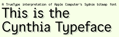
I had three revelations about Cynthia: the 12 pt bitmap matched up with the 11 pt outline (yikes! Good thing it's easy enough to reduce it--the only problem being that I basically threw away 6 hours of hand editing the hints), a few characters needed to be completely redone to be more in line with the bitmap and the font needed to better simulate the quasi-monospaced nature of Sydnie. So here's the new picture:

This is the Cynthia Typeface

I still have a little tweaking do do on the character shapes - making the font quasi-monospaced required stretching some letters and shrinking others. I see that the "f" needs to be a bit longer so that it doesn't produce a big gap; same goes for the "t". I'm thinking I'll put this one on the back burner for a while so that I can work on the TrueType hinting of Nu Sans-Bold (which is about 20% done at the moment). One of the neat things about Nu Sans-Bold is that it will encompass a much larger character set - it will have all the characters that are present in Apple's system fonts (this will be a boon to non-English systems). Unicode makes it all possible.

Friday, May 21, 1999

Cynthia

I noticed an interesting technote on Apple's web site today. It deals with an issue that I've figured out on my own a long time ago :-). Basically, the technote implies that anti-aliasing (or font smoothing, if you prefer) looks best at 18 pt and above.

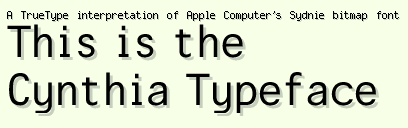
Well I did it in just one day - I created the basic character outlines for the Cynthia typeface in under 10 hours. Tomorrow I'm moving on to the hinting so that I can release a demo version ASAP. Basically, Cynthia is a TrueType font that emulates the appearance of Apple's Sydnie bitmap font at all different sizes. So what, you as is Sydnie? It's a font that's embedded in Apple's QuickTime Player 4.0. It's the cool little font that appears when you press the copyright button, or connect to a streaming server. Basically, it's what I'd call quasi-monospaced. Most of the characters fit into a 6 pixel width, but some of them (like "i" and "l" as well as most of the punctuation) is proportional - making it only appear to be monospaced. I have no idea why Apple would want to do this, but hey, it's their show, right? Anyway, here's a screenshot:

This is the Cynthia Typeface

Thursday, May 20, 1999

Star Wars: Episode I

I went to the premier of Star Wars: Episode I last night. I won't ruin it for you, but it was very cool - go see it! I also got my internet connection straightened out with @Home. I have a ton of e-mail to sort through - please be patient :-)