Tuesday, May 25, 1999

Three revelations about Cynthia

I had three revelations about Cynthia: the 12 pt bitmap matched up with the 11 pt outline (yikes! Good thing it's easy enough to reduce it--the only problem being that I basically threw away 6 hours of hand editing the hints), a few characters needed to be completely redone to be more in line with the bitmap and the font needed to better simulate the quasi-monospaced nature of Sydnie. So here's the new picture:

This is the Cynthia Typeface

I still have a little tweaking do do on the character shapes - making the font quasi-monospaced required stretching some letters and shrinking others. I see that the "f" needs to be a bit longer so that it doesn't produce a big gap; same goes for the "t". I'm thinking I'll put this one on the back burner for a while so that I can work on the TrueType hinting of Nu Sans-Bold (which is about 20% done at the moment). One of the neat things about Nu Sans-Bold is that it will encompass a much larger character set - it will have all the characters that are present in Apple's system fonts (this will be a boon to non-English systems). Unicode makes it all possible.

Friday, May 21, 1999

Cynthia

I noticed an interesting technote on Apple's web site today. It deals with an issue that I've figured out on my own a long time ago :-). Basically, the technote implies that anti-aliasing (or font smoothing, if you prefer) looks best at 18 pt and above.

Well I did it in just one day - I created the basic character outlines for the Cynthia typeface in under 10 hours. Tomorrow I'm moving on to the hinting so that I can release a demo version ASAP. Basically, Cynthia is a TrueType font that emulates the appearance of Apple's Sydnie bitmap font at all different sizes. So what, you as is Sydnie? It's a font that's embedded in Apple's QuickTime Player 4.0. It's the cool little font that appears when you press the copyright button, or connect to a streaming server. Basically, it's what I'd call quasi-monospaced. Most of the characters fit into a 6 pixel width, but some of them (like "i" and "l" as well as most of the punctuation) is proportional - making it only appear to be monospaced. I have no idea why Apple would want to do this, but hey, it's their show, right? Anyway, here's a screenshot:

This is the Cynthia Typeface

Thursday, May 20, 1999

Star Wars: Episode I

I went to the premier of Star Wars: Episode I last night. I won't ruin it for you, but it was very cool - go see it! I also got my internet connection straightened out with @Home. I have a ton of e-mail to sort through - please be patient :-)

Sunday, May 16, 1999

Nu Sans-Bold and internet access woes

Nu Sans-Bold is shaping together nicely. I finally figured out a way to include all the characters that are found in the Mac system fonts (a ton of international characters and special symbols used by the Mac OS to display in menus). A tool called AAT Font Tool adds the proper cmaps so that the system will be able to access the characters it needs. I've also finished up the preliminary hinting (no deltas - just a rough first pass) on A-Z and a-n. I'm using Microsoft's Visual TrueType 4.2 to do this manual hinting. This new version is really a lot faster to work with than the previous one.

In other news: @Home cut off my service on the 12th. A guy came out and put a filter on my cable. It turns out that I wasn't being billed for my internet access. I called tech support 5 times: first they said that the cable wasn't actually disconnected, it was just a soft disconnect done from their office. Then they said that I wasn't disconnected at all - the problem was with my modem - they were able to bill my credit card on the 12th. Finally, I called on Saturday and the tech on the line said that he needed to send out a tech to fix the problem. So far, @Home has admitted no blame (I'm sure that the techs are ordered not to do that). Oh well, I can't really access the internet more than a few minutes a day until Tuesday. What a pain!

Thursday, May 13, 1999

More work on Tiny

I worked a bit more on Tiny. The regular weight is all done; I've polished up the letters A-O so that they will look good when printed. I've also been working on some issues with Nu Sans-Bold. It turns out that the cmap needed a little tweaking. I expect to release an updated version on Monday - hopefully I'll have the font packs ready by then, too (The font packs are groups of fonts released together at a discounted rate).

Thursday, April 29, 1999

New software!

Another exciting day! I received two pieces of software today. The first (and probably most important to visitors of this site :-) is the Macintosh FontLab 3.0. This is a very sophisticated program; just a casual trial today proves that there is a lot of power under the hood. While I probably won't completely give up Fontographer, I'm going to start migrating all of my final output to FontLab.

The other software arrived in the mail from Sweden. ReBirth RB-338 - an analog synthesizer and drum machine in one. Here's another program with a lot of power under the hood. I was especially impressed by the fact that I can route the audio output of ReBirth into my Cubase sequencer - and it's digital the whole way!

In more font related news: I'm finishing up the long-awaited demo of Nu Sans 9.0. I just have a few characters to get straightened out and then I'll upload it to Info-Mac before the end of the month. I'm still debating whether I should put it on my web page before it gets posted on Info-Mac.

Wednesday, April 28, 1999

Don't quit your day job?

I've had a pretty busy and (somewhat) productive day. I tried increasing the icon sizes from the main page from 32 pixels square to 48 pixels square. That worked OK, but everything else needed to be increased as well. Unfortunately, even at the highest resolution on my iMac, the whole page doesn't display without having to scroll - back to the drawing board, I guess. I might be able to keep the bigger icons and then just modify the rest so that it doesn't take up so much space.

I also put in a lot more work on Tiny. I've created an outline font to be used as a base for the fully hinted TrueType font. My goal is to have something that looks great on screen at those tiny point sizes, but can also be used for display purposes. So I spent a few hours adjusting side bearings and trying out different stem weights.

I'm trying to keep this page updated daily, as Scooter Graphics is my only job. That's right, I've done the proverbial worst thing in the shareware world; I've quit my day job :-). I've found that I can make just as much money working 4 hours a day at home as I could working 8 hours a day 20 miles from home. Less wear and tear on my truck and my kitty gets to see me more. It's the best of both worlds!

Monday, April 26, 1999

Receipt released

Well, I decided to make Receipt just a plain ole' TrueType/PostScript font. A demo version is now available. I'm currently filling out the character set which should make it easier to use in non-US systems. (Of course, accented characters are not really a possibility!)

Thursday, April 15, 1999

Receipt

From the receipt of one of my favorite diners comes the inspiration for "Receipt" (clever name, huh :-). Receipt is a two weight font. Right now it's just a bitmap font, but I intend to create a MM font of each weight to simulate the wear and tear of the ribbon. Why? Because I can!

D. LISH'S HAMBURGERS receipt

Thursday, March 18, 1999

Future Sans

I again worked on the Future Sans bitmap fonts. I Straightened out some of the curves and created an italic for the 18 pt font. It's starting to look like the future :-)
Future Sans 18pt

Tuesday, March 16, 1999

In the future, all fonts will be hard to read

I worked on the Future Sans bitmap fonts some more. This time, I came up with a regular weight at 18 pt (double 9 pt Espy Sans - which was supposed to be the default font view under Copland). The result is OK, but needs some more polishing:

In the future, all fonts will be hard to read.

I'm thinking of eliminating some of the curves. At 18 pt, they don't really add much readability and they tend to close up the letters. I'll post the results later...

Sunday, March 14, 1999

Future Sans

As I was working on Tiny (a new bitmap font at 6, 7, and 8 pt, available in regular and bold), I got to thinking in the other direction; as monitors and video cards start supporting higher and higher resolution, the problem of the very fonts we use to navigate the system become more accurate. Most Mac monitors are set to 72 ppi by default. Imagine the effect of doubling the ppi (to 144 ppi - about half the resolution of a 1st generation laser printer). Everything is now half as big as it used to be. Heck, I need to put my glasses on when I'm running 1024x768 right now on my iMac!

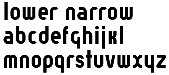
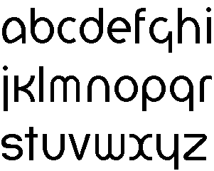
So I came up with a solution: Future Sans. This is another bitmap font (I've got bitmaps on the mind these days!) that is meant to be used as a system font at 24 pt. My goal was to take the 12 pt Espy Sans and interpolate it up to 24 pt. As I was working on this, I discovered that the result was a bit different than 24 pt Nu Sans (my scalable version of Espy Sans). Looking at other fonts (such as Charcoal, Helvetica Bold, etc.), I found that most fonts are not optimized for 24 pt display.

Now maybe you don't think that this is much of a problem - after all, there's anti-aliasing, right? The problem with anti-aliasing is that it "fuzzes" the edges of the letters to achieve an effective doubling of the resolution. My studies have shown that fuzzy text is harder to read at text sizes than non-fuzzy text.

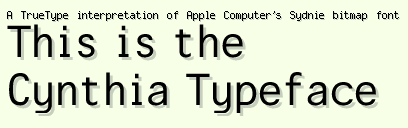
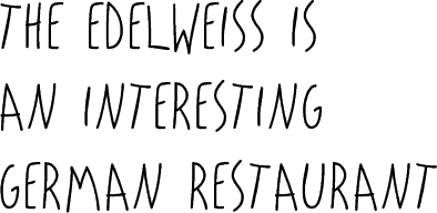
So here's an example of how I see Future Sans being used as a system font:
File Edit View Special Help

Thursday, January 07, 1999

Important upgrade to Nu Sans

I've just released an important upgrade to Nu Sans. Version 8.5 adds the Euro symbol and is now compatible with Mac OS 8.5. A Windows version will be available shortly, but for now, this is a Macintosh exclusive release. Check it out!

Sunday, September 20, 1998

1998 3rd Quarter Update

Okay, another long stretch without any updates to the log! I'm sorry :-( I have been busy, however. I just bought a house in Spokane, finished up two semesters at C.W.U. and started a new job selling insurance.

As far as the font-side of my life: I'm working on a new version of the Newt color scheme (to go with the Nu Casual font) and an update to Nu Sans. I'll probably wind up doing a small caps and old style figures for Nu Sans when I'm through with the update. There was also a request for a "light" version of Nu Sans. Maybe I'll do that, too.

Thursday, January 01, 1998

Worked on Nu Serif

ABCDEFGHIJ

  • Finished these uppercase characters.
  • I will work on Nu Serif again when I get back to school,
    since I'm packing everything up right now.

Tuesday, November 25, 1997

Worked on Lower Narrow

lower narrow

  • This is narrow version of Lower. It is a bit different from Lower-Regular but it still bears a family resemblance.
  • The next thing to work on is finishing up Lower-Regular (e.g., finishing up the whole character set, polishing up the spacing, etc.)

Tuesday, November 11, 1997

Worked on Lower

lower

  • Lower is based on an experimental typeface designed by Herbert Bayer in 1925. Bayer's typeface was firmly rooted in the Bauhaus, with strict geometrical construction. My interpretation is meant for more general use than Bayer's original typeface. To do this, I have started by using consistent x-height and overshoot to create a regular weight version of Bayer's font (Bayer's original font was very bold, almost a black weight). This font will be suitable for body text as well as headline use. I plan to extend the design by creating light and bold version as well
  • I have tried to keep all the distinguishing features of Bayer's original typeface, while bringing the design up to date. For example, the "r" in Bayer's version terminates in a straight line, mine is a slight curve. Tell me what you think.

Thursday, September 25, 1997

What I've been up to lately...

You might be wondering what I've been up to lately. Well, I just haven't had a lot of time to keep up this log. But I have been working on a number of projects. Some of them are:

  • Another update to Nu Sans. This time, I am basing Nu Sans on Espy Sans 10 pt instead of 12 pt. I have just finished the plain version and expect to post something soon for you to download.
  • A lowercase font.
  • I've released several different version of Virtue. The latest one is 1.9, which is available now from the web page.

Wednesday, May 21, 1997

Worked on eCasual Headline


  • This is a tall casual font based on the kind of handwriting used for some of the banners on eWorld. I plan to create a regular text version as well as the tall version.

    The Edelweiss is an Interesting German Restraunt
  • As you can see, it needs some work :-) I'm going to straighten out a few characters (like the "T", "N" and "A" and tweak the spacing a bit until I get something worth releasing to the general public.

Released Jubal Sans (Formerly the Multiple Master Font)

You can see and download it on the Jubal Sans page.