However, good news! They don't make software manuals anymore, so you just have to "learn by doing." I'm not sure if this is an improvement, but at least I don't fall asleep 200 pages in anymore. :-)
So on Monday's update, I put up an idea for the new home page for Scooter Graphics. I've tweaked it a little since then. I still like the tabs at the top, but I didn't like how the blue line goes all the way across underneath the tabs. It made the "SG" logo look unbalanced. So I changed that and also designed a few different section pages. Yeah! This is going to be much easier for folks to get around in. The old navigation system kinda just grew as the site expanded, so it wasn't planned like I'm doing now.
Here's a peek at what I've done today:
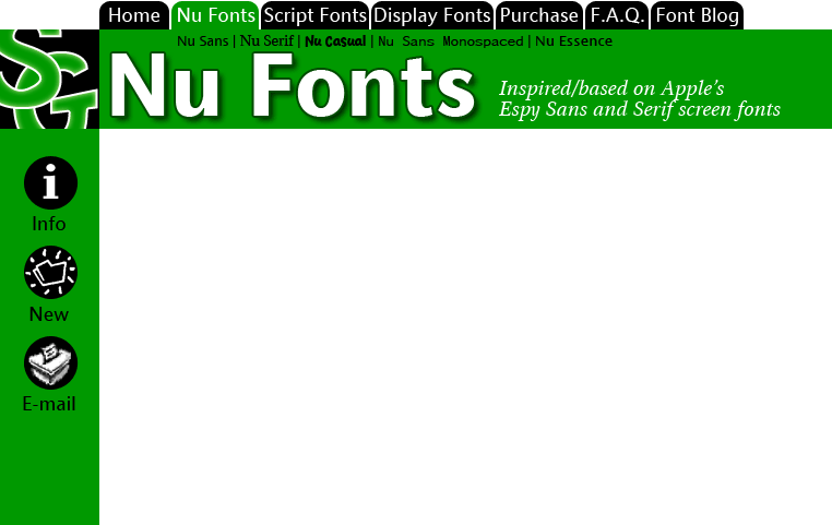
It's so GREEN! I like it :-) What do you think about the subsection titles? Go ahead and e-mail me if you think this is/is not a good way to get to the different fonts in the section. Note that this is the main section page--I'll have a quick overview of each font with a link to download each one just on this page. The subsection pages will just be for folks who want to know more before downloading.
Here are the rest of the section pages I did today, just three more to design...
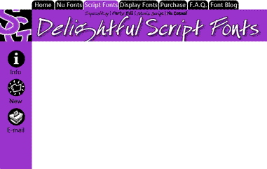
Obviously not actual size! What do you think about the word "Delightful?" It's one of my pet words these days. And it just happens to have a "g" in it which is very cool since Especial Kay has an awesome "g" in it.
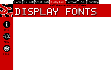
So I've pretty much got all my fonts right there in these three screens. I have more designs than these, but I think I'd like to showcase my best work and let some of the older fonts go--at least until I can get time to improve them.
In other news, I just got Starship Operators today from Right Stuf. I'll be watching that tonight! KOTOKO does the opening and ending themes for the show. She's just awesome. I saw her concert and panel at Anime Expo '05. She actually brought a band with her! Most J-Pop artists that come over here just perform to a tape, but she put on a full show--she even had costume changes. Very professional. I can't wait for her CDs to be available here in the states.
The English dub was done by The Ocean Group. They do most of Gundam, so space battle shows are no stranger to them! I recognize a few familiar voices. Nicole Bouma (last heard as the adorable Tanpopo in Dokkoida?!) and Kirby Morrow (Trowa Barton from Gundam Wing and Miroku in Inu Yasha) put in some good work.
(And, yes. I'm trying to update the font blog every weekday from now on :-)
No comments:
Post a Comment