Monday, January 02, 2006

Table-less layout using CSS

Happy New Year!

I'm getting a lot closer to having a table-less layout using CSS. I'm finding that of all the technical tricks I'm learning, the most important trick is to stay organized. I've actually sketched out the different parts of the site on a piece of paper and refer to this as I'm working with nested DIVs. It's really helpful.


What isn't helpful is font embedding. I'm trying to acheive a certain "look" based on the eWorld user interface. So I need to use a bold narrow font for some of the text. Unfortunately, Impact is a bit too bold and not narrow enough. Arial Narrow is OK, but doesn't really duplicate the look. If I could just embed the font I want to use, I wouldn't have to go through this compromise! But current embedding technologies for web browsers are pretty bad and not well supported.

So maybe I'll use images for the text I want. I know that sounds very non-CSS-y, but as a designer, it's what is necessary. Hopefully the future will provide a better solution. In the meantime, I'll just make sure that the alt tags of the images are correct. THAT is a compromise I can live with :-)

Friday, December 30, 2005

Simple = Simple

Got up this morning at 5 am and continued. It turns out that I had misunderstood how padding works. I was previously using layer positioning to put the tabs where they should go. However, this approach doesn't work when you want to cover something that is to the left with white (the blue bar is a repeating image, 1 px tall by 91 wide). So I knew I had to put the layer at the very left and top of the page. But when I did this, the tabs lined up against the SG logo, not the colored banner.

So if I can't move the layer, what do I do? I guessed that the solution was in moving the content inside the layer. All it took was a simple padding-left: 91px and my blue bar problem was solved.

The lesson here is that if you are trying to do something simple, the implementation should also be simple. Stop and re-think if it is not, chances are, you've missed something basic.

In other news, I am eagerly awaiting Momoi Haruko's WONDER MOMO.i CD from CDJapan. I also ordered Majokko Tsukune-chan volume 1 + CD--an OVA series I know almost nothing about. Momoi plays Tsukune-chan as well as performing the OP and ED music. That's good enough for me! Momoi is probably best known for her role as Nurse Witch Komugi. She was also the singer/songwriter in the duo UNDER17. Her voice is unbelievably cute :-)

Thursday, December 29, 2005

Side bar trouble

Almost have the design in CSS down... As you can see, the side bar is giving me a little trouble. I'd continue working on it, but if I stare at this screen any longer, my eyes will fall out.

Wednesday, December 28, 2005

I take it all back

CSS-based formatting is the way to go. I've spent the day struggling to understand how to make tabs with text instead of images using CSS. Basically, I've put together two techniques I learned from two different web sites to just get the simple effect I was trying for. Now that I've spent all this time, I fell like I'm fully committed to making CSS-based formatting the default for this web site.

The benefits are pretty amazing, even if you don't utilize all the features CSS can provide--seperate style sheets for print vs. on screen, more accessible web design by reducing the reliance on images for navigation, layers, etc. So I'm going to spend the time to do it right. It's the language of the modern web.

I've also decided from a practical and design perspective, different colors for each section of the web site is no good. So we'll be going with what I call "Scooter Blue" or #3366CC AKA #36C. You know, THIS COLOR. Please look forward to it!

Tuesday, December 27, 2005

Navigation Bars

So I have been working on the navigation bar at the top of this page (soon to be at the top of every page). I added a mouseover in Adobe ImageReady, but I'm not sure it's absolutely necessary. It's neat but maybe a bit gimmicky. I took a look at the HTML for the mouseover and was pretty surprised to see how long it was! Back in the old days of the Internet, that kind of superfluous nonsense wouldn't be tolerated. Why, eight years ago if you put that on your page, you would have people boycotting your site outside your house with picket signs and everything (my memory on this may not be exact...)

So back to reality. I'd like to have this on every page and if I need to make changes, I'd like it to change automatically (or at least magically) in GoLive. I'm sure there is some way to do that using stationary or something.

Friday, December 23, 2005

Cubase acting up

Aggh! I know that it is a poor workman who blames his tools, but Cubase is starting to drive me nuts! My Tascam firewire audio interface doesn't fully control Cubase even though it's in Mackie emulation mode... Why? Who knows... Maybe I need to upgrade. Why can't stuff just work? Should I spend the money to upgrade from SL 2 to SX 3 or should I jump the boat entirely? I think that once I get all my hardware/software stuff on my music mac sorted out, everything should just work all the time. I just need to do some more research to get everything to work properly. Next year, that is!

Merry Christmas, y'all! :-)

Thursday, December 22, 2005

Optical illusion design

Had a good day at work today! My co-worker improved a design I had started while I was on vacation and did a terrific job of it, too. I was happy to see my original--hastily put together--design for a brochure basically still there but noticeably improved. He also created other material related to the brochure in the same style. One of the things I liked that he did was to have an optical illusion for the headlines like this:


The effect on the printout was more extreme, but the idea is that the lower parts of the letters look darker than the top parts. Since this design will be one we will update each month (it's for a new event each time, so the layout stays the same but all the content changes), I was worried when I saw this! I thought that I would have to create the two-tone letter effect each time in Illustrator :-) But it's actually just a trick of the eye. So it's easy to do and looks really neat. I'm sure the client will be impressed, too.

So I've been thinking about changing how I do font distribution at Scooter Graphics. I'm thinking that perhaps it would be better to e-mail the registered versions of fonts to people rather than making them download it from the web site. Font files are pretty tiny, especially so with OpenType, so I think that this might be easier for folks. They also wouldn't have to worry about password-protected zip files (some people have a little trouble with those in Windows), since the font will just be there as a file in the e-mail.

However, this will mean that either Kagi or I will have to do the e-mailing. I'm thinking that Kagi won't do fulfillment without charging me extra--and I'd like to avoid that. Another idea might be adopting PayPal as a payment option. That has some interesting possibilities, too!

In the end, I would rather adopt a solution that makes things simpler for customers than one that confuses them.

Wednesday, December 21, 2005

Nested Tables and Karin

So this is the new "look." (Note: The buttons and tabs are not currently functional--I'll get them working this weekend.) I was thinking of doing this using CSS and PNG graphics, but then thought, "Huh? Am I trying to design to please some web standards board or am I just trying to get something done that will work well in most browsers?" So it's back to tables! I am using table background color for the vertical and horizontal color bars. Maybe this won't work in older browsers, but at least they will see something. If I used CSS, they wouldn't see anything close to the intended design.

I think when designing for the Web, you just got to go with what works and what you know :-) Anyway, the new layout uses a new wrinkle that I thought up to avoid nested tables, so I guess I'm improving the implementation as well.

So I've been watching a new series called Karin. It's about a family of vampires who live in Japan. The oldest sister, Karin, is a bit of an oddity, though. Instead of sucking blood out of humans, she does the opposite! Her body produces more blood than she needs, so when she bites someone, she is actually giving them a transfusion of vampire blood! (Of course, since vampire blood is incompatible with human blood, there's no problem--or whatever...)

Of course, if she can't find a "victim" in time she has an embarrassingly huge nose bleed (hey, it has to come out somewhere, right?). Did I mention that this is a romantic comedy? :-) The manga will be coming out next year from TokyoPop--retitled "Chibi Vampire." Perhaps the anime will be licensed here, too...

Tuesday, December 20, 2005

I'm so glad I took time off work!

I haven't taken more than a day here and a day there in over a year and a half. I didn't realize how burned out I was. So I have had a lot of success lately with my music and web site design. I'm at least a couple years behind the times on Cubase (my main music program) and Adobe GoLive (I used to use Page Mill). You know the part I hated most about college? Reading textbooks. That's what reading software manuals feels like, too.

However, good news! They don't make software manuals anymore, so you just have to "learn by doing." I'm not sure if this is an improvement, but at least I don't fall asleep 200 pages in anymore. :-)

So on Monday's update, I put up an idea for the new home page for Scooter Graphics. I've tweaked it a little since then. I still like the tabs at the top, but I didn't like how the blue line goes all the way across underneath the tabs. It made the "SG" logo look unbalanced. So I changed that and also designed a few different section pages. Yeah! This is going to be much easier for folks to get around in. The old navigation system kinda just grew as the site expanded, so it wasn't planned like I'm doing now.

Here's a peek at what I've done today:
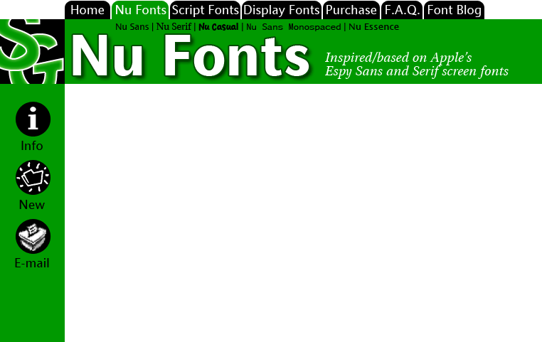

It's so GREEN! I like it :-) What do you think about the subsection titles? Go ahead and e-mail me if you think this is/is not a good way to get to the different fonts in the section. Note that this is the main section page--I'll have a quick overview of each font with a link to download each one just on this page. The subsection pages will just be for folks who want to know more before downloading.

Here are the rest of the section pages I did today, just three more to design...
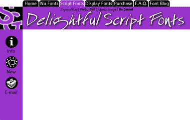

Obviously not actual size! What do you think about the word "Delightful?" It's one of my pet words these days. And it just happens to have a "g" in it which is very cool since Especial Kay has an awesome "g" in it.
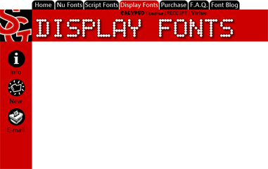


So I've pretty much got all my fonts right there in these three screens. I have more designs than these, but I think I'd like to showcase my best work and let some of the older fonts go--at least until I can get time to improve them.

In other news, I just got Starship Operators today from Right Stuf. I'll be watching that tonight! KOTOKO does the opening and ending themes for the show. She's just awesome. I saw her concert and panel at Anime Expo '05. She actually brought a band with her! Most J-Pop artists that come over here just perform to a tape, but she put on a full show--she even had costume changes. Very professional. I can't wait for her CDs to be available here in the states.

The English dub was done by The Ocean Group. They do most of Gundam, so space battle shows are no stranger to them! I recognize a few familiar voices. Nicole Bouma (last heard as the adorable Tanpopo in Dokkoida?!) and Kirby Morrow (Trowa Barton from Gundam Wing and Miroku in Inu Yasha) put in some good work.

(And, yes. I'm trying to update the font blog every weekday from now on :-)

Monday, December 19, 2005

Don't make me think about web design

One of the things that Don't Make Me Think talks about is the kinds of things to put on the home page of a web site. So I'm not just working to create new graphics and such, but also make it easier for first time visitors to see what Scooter Graphics is all about. So here's what I've come up with

Site ID: Scooter Graphics
Tagline: Free and shareware fonts designed by Marty Pfeiffer
Welcome Blurb: Welcome to Scooter Graphics. Marty has been designing fonts since 1994. You can download and try these typefaces exclusively from this web site. Some fonts on this web site are free and some are reasonably-priced shareware.
Tabs: Home Nu Fonts (Nu Sans, Nu Serif, Nu Casual, Nu Sans Mono), Script (Moris Script, Especial Kay, Marty Bold), Display (Electrode, Receipt, Scooterboy, etc.), Purchase, F.A.Q., Font Blog

I don't really think that Scooter Graphics needs a search function, but maybe I'm wrong. I'll be sure to ask a few folks and if it's handy, I'll put it in. Since most folks aren't limited to 640x480 monitors these days, I'm going to increase the size of the graphics by 150%. Another thing I'm thinking about is putting the most recent entry from the font blog on the home page, with a link to the rest. Blogs are pretty popular these days, aren't they?

Here's my first try in Photoshop:


So anyway... In episode 37 of Pretty Cure, in one scene the bad guys brushing their teeth. Who knew? I guess folks from the Dusk Zone are not only interested in obtaining the power of the Prism Stones, but also maintaining proper oral hygiene. Of course, in the very next episode, Nagisa (Cure Black) is brushing her teeth during the previous episode recap. Good thing, too. You don't want kids getting the wrong idea about taking care of their teeth. It's not just something that bad guys do!

Friday, December 16, 2005

I've decided to update Scooter Graphics

This update is going to be on two fronts: this site and the fonts. I'll be updating the site first. I've just finished reading Steve Krug's excellent Don't Make Me Think: A Common Sense Approach to Web Usability (2nd edition) and I'm going to put what I learned about usability into Scooter Graphics. It's going to be great!

I'm also going to be using Adobe GoLive to update the site from now on. That will make things much easier for me to update. In the past, I've been editing the HTML by hand when I've had to, since Adobe Page Mill doesn't work in Mac OS X (and has been discontinued by Adobe). It's fun learning new things. :-)

So I think that the eWorld layout will change so that I can have persistent navigation on all the web pages. I have to find a way to do that and still be true to my roots. Wish me luck!

The other part of the upgrade will be the long overdue conversion to OpenType. Basically, OpenType makes things a lot simpler for users of fonts, while adding a lot of flexibility. They also work on Mac and Windows, so you don't have to have two different versions of the same font if you work on both platforms. Any moderately recent version of Windows or Macintosh has OpenType support built in.

I will still keep the PostScript and TrueType versions for folks who are "retro-computing." I don't want to keep anyone from using my fonts. However, since I'll be concentrating on OpenType from here on, PostScript and TrueType versions of my fonts won't be updated regularly. This isn't so bad, though, since all my ideas for updates have to do with OpenType-specific features.

As they say on Science Ninja Team: Gatchaman, "Look forward to it!"

Sunday, September 21, 2003

Tuesday, January 21, 2003

Retraction on update news

Actually, that should have read, "next Tuesday" :-). Anyway, the Nu Sans Monospaced family is done with the addition of the bold italic. The Nu Font pack has also been updated.

Friday, January 10, 2003

Nu Sans Mono update

I'm working on updating the site and getting ready for my latest release. With the addition of bold italic, I've finally finished off the Nu Sans Monospaced family. I will release the Nu Font Pack as well as the individual family this Tuesday.

Tuesday, January 02, 2001

Essential ideas

Happy new year! Today I began some "cleaning up" of Nu Sans that has been needed for a while. Basically, a few bitmap characters (still used for on screen display in PostScript) were bothering me. I'm also going through and making sure that the accented characters look the same as the non-accented characters (as far as the base glyph is concerned, at least!). This was only a problem in some of the italic characters. Also, it looks like I'll have to re-design the 24 pt. bitmaps for the italic. They aren't very good. All in all, it's not stuff that deserves a full version number upgrade, but it will be a nice update for some folks.

While I was taking a look at Nu Sans today, I pondered the idea of somehow merging Nu Sans with Essence to achieve better printout. But then I decided that the focus for Essence should be on-screen, while Nu Sans is for printing. I think that people have been waiting for a "true" Espy-clone that they can use as an anti-aliased font on screen. So I'm going to just stick to that idea and see where it leads me.

I'm also considering making Essence TrueType only. I know that there are a few PostScript holdouts who will be mad about this, but I think that the TrueType format gives me the most flexibility for an on-screen font, without having to rely on bitmaps to do the job (and I'm still cleaning up the job on Nu Sans--nearly a year after the last release!). Also, I think that I may be losing customers who don't know and don't care about the difference between PostScript and TrueType. They don't want to worry about formats, they just want to use the font. Having one choice might make it easier on folks to decide to download and install the font.

Saturday, December 30, 2000

First attempt at Essence

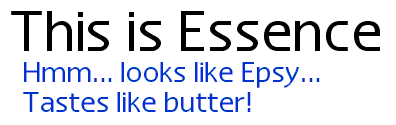
Into the wee hours of the morning, I finished off the alphabet characters (and a few punctuation marks) for my newest font: Essence. I've got a pretty good description of what I'm trying to accomplish in the last log entry, so I won't repeat myself. But I thought that a screen shoot might be a good thing to show at this first "milestone" for Essence...


If it looks like Epsy (or Espy, whatever, it's early in the morning, you can't expect me to spel!), that's intentional. I printed out a bunch of text to compare Essence to my Nu Sans. Essence wins hands down as being the most "Espy"ish. It looks good on paper, but my main goal is to have Essence be a great screen font first--it should look good under any circumstances: aliased, anti-aliased, grid fitted, whatever. I'll explain later...

Monday, December 04, 2000

The essence of a good font

Just watched the first part of the new "Dune" on Sci-Fi. It looks pretty good, but I'd like to see the David Lynch version after so that I can compare. I saw it as a kid and didn't understand it too well. Perhaps now that I am older and wiser it will make more sense :-)

Along the same lines as the new Nu Casual, I am creating a new font. This new font is based on Espy Sans, but it goes a different direction than my Nu Sans. Where Nu Sans is a printer-friendly Espy Sans, the new font will try to more closely match the design of the original bitmaps. I have found that basing a font on simply one bitmap size as a model is not optimal.

The process will take quite a bit more time, as each finished font is the average of four fonts. I design an outline to fit the 10, 12, 14 and 16 bitmap fonts of Espy Sans. I know that I have a good outline by performing a simple check: I generate a bitmap font double the size of the font I'm working on. If that looks good, I'm set. After the outlines for the four fonts are good, I combine them into one font (actually a three step process: 10 + 12, 14 + 16 and then combining the results of those two).

I was toying with a name for this new font. When I had to change the name of Epsy Sans, I polled my users and they all voted on Nu Sans. This got Apple off my back. It was a week later when I got an e-mail from one of my users congratulating me on the new name, saying that I was able to thumb my nose at Apple after all. You see, "Nu Sans" is pronounced the same as the English word "nuisance." Indeed, I was a nuisance to Apple :-)

So I thought about basing the name of the font on this chance semblance of syllables. I wanted to keep something of Espy Sans (what inspired the new font) while still respecting the legacy of my work on Nu Sans. So I started thinking about "E" as in Espy. E Sans? No, that won't do--too obvious. Apple would burst a blood vessel. But there is a word that sounds something like it: "Essence." I like the implications of the name. It is the literally the essence of Espy Sans. I am taking the individual characteristics of each bitmap size and merging them into one font. It really works for me.

I should have some pictures up soon.

Sunday, August 13, 2000

Over the handlebars

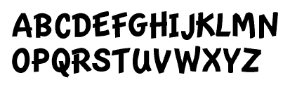
I went over the handlebars of my bicycle on Tuesday, so I've not been able to do much work on the computer lately. However, I'm starting to feel better. I was able to work sporadically on an update to Nu Casual. I'm creating outlines for each of the three bitmap sizes of the Newton handwriting font and then merging them together. Previously, I just based Nu Casual on the 20 pt. So far, I'm very pleased with the results. Here's the new uppercase:

Wednesday, July 12, 2000

John Steed

OK, here's John Steed:

Little Kitty

And, back to sleep, again...

Sleepy Kitty

Tuesday, July 11, 2000

Welcome to the family

I'm working on an update to Nu Serif that brings two new fonts into the family: SemiBold and SemiBold Italic. I've also discovered a few discrepancies in the design of Nu Serif (even after the 4.0 "harmonization" release a few weeks ago). Just a few minor things, like the regular version of a letter would have one or two more control points than the bold version. There were also a few major things that I changed. I removed the serifs from the italic "r"s and created a new "y" for the bold italic, so that it would look more like the italic "y". The "y" I had before was completely different!

This release will also be the start of a new policy at Scooter Graphics: when a font is released, the font pack will also be released on the same day. This might put back the release by a few days, but I think that in the long run it will be much less confusing for everyone. I'm not going to worry about waiting for info-mac to get my new release, but I will start uploading to them so that users in other countries can have an easier time downloading my software.